An Illustrated Antislavery Song: Music with a Mission?

Featured

by Rachel Cross

Rachel Cross is a PhD candidate at Cardiff University whose area of research is Victorian illustrated songs. Her work investigates how the intersections between the three media of illustration, text and music reveal new insight into key issues of the Victorian period. She started her journey to this fascinating topic through music; initially studying piano, strings, and the theory of music, she gained diplomas in piano teaching and in the theory and criticism of music. Going on to study English at undergraduate and master’s levels, she focused particularly on the interrelations between text and illustration. She teaches about the relationships between text and illustration to undergraduates and has spoken about Victorian illustrated songs at several symposiums and conferences.

Illustrated songs were pervasive in the print culture of the nineteenth century: it is estimated that between 80,000 and 100,000 pictorial music titles were published in England between 1820 and 1885 alone. (1) They were popular in both America and Britain and were to become even more widespread with the rise of vaudeville (in the States) and music hall (in Britain) towards the end of the century. American and British songs traversed the Atlantic, bought largely by bourgeois families for domestic musical entertainment. The distinctive blend of the three art forms of text, music and illustration in one publication offers opportunity for an exciting tripartite view of nineteenth-century Western life. Examining intersections between presentations in these three media, this blog focuses on how an American antislavery song reveals nineteenth-century perceptions of race and nation. Its illustrated cover (see figure 2) depicts the fugitive whilst on the run, dramatically picturing the plight of the runaway. However, whilst the illustration shows the famous runaway, Frederick Douglass, it, and the song’s lyrics and music, also include other allusions which complicate the reading of ‘The Fugitive’s Song’ as connected with the antislavery mission.

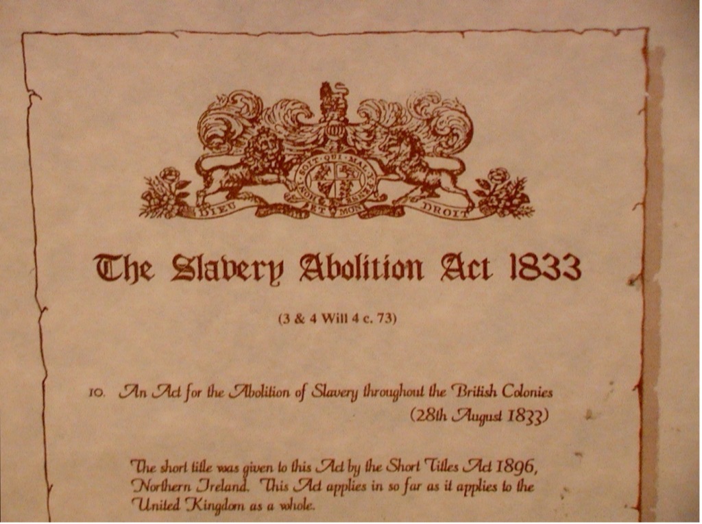
Figure 1: Slavery Abolition Act, 1833. Photo credit: Wreford Miller, ‘Abolition’ by Wreford is licensed under CC BY-SA 2.0.

After slavery in British lands was abolished in 1833 (see figure 1), American abolitionists campaigned with likeminded Britons to end slavery in America. The fight against slavery adopted a multimedia approach. Printed matter provided the main impetus for the abolition movement to spread its antislavery message and slave narratives and poetry were also augmented by songs and performances in both America and Britain. ‘The Fugitive’s Song,’ (see cover, figure 2) was published in Boston in 1845. Massachusetts was a centre for the abolition movement in the nineteenth century and Boston was a hub for early American music publishing. In May 1845, Frederick Douglass also published his critically acclaimed autobiography in Boston, Narrative of the Life of Frederick Douglass, an American Slave, Written by Himself. Publication of this song, in tandem with Douglass’s book, is testament to the abolitionists’ multimedia crusade. However, I argue that this song also revealingly functions as a serenade to the ‘enlightened’ Northern states of America.
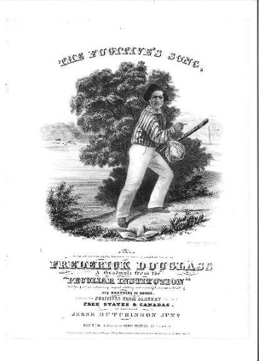
Figure 2: ‘The Fugitive’s Song’ cover, 1845. Lithograph. Music by J. M. White, words by Jesse Hutchinson Junior, lithography by E. W. Bouvé (Boston: Henry Prentiss, 1845). Accession Number: 80.7568.365, Lincoln Memorial University, Abraham Lincoln Library and Museum, Harrogate, Tennessee.

Douglass escaped slavery in 1838, subsequently becoming a famous antislavery campaigner in both the States and Britain. The popularity of slave narratives meant that many people were familiar with Douglass’s story. Frederick Law Olmsted, in his A Journey in the Seaboard Slave States (1856), even asserted that Northern views on slavery were constructed from the reading of slave narratives. (2) Whilst it is dedicated to Douglass, ‘The Fugitive’s Song’ was, however, like most antislavery matter, produced by a team of white people. The words are by Jesse Hutchinson Junior, with the music by J. M. White, and the cover illustration by the engraver and lithographer E. W. Bouvé. Initially testifying to the power of abolition songs, Douglass himself stated:

I especially have a reason to feel a grateful interest in the whole Hutchinson family  ̶  for you have sung the yokes from the necks and the fetters from the limbs of my race. (3)

Indeed, as vehement abolitionists and members of the Anti-Slavery Society, the Hutchinson family used the power of music in the Northern fight against slavery in the 1840s and 1850s. (4) Scott Gac contends that, ‘Starting in 1841, the Hutchinsons transformed themselves from backwoods, church-trained musicians to the most popular musical family in America’. (5) By the end of the Civil War, Douglass had, however, changed his opinion about white involvement, declaring, ‘Do nothing with us! Your doing with us has already played the mischief with us’. (6) Indeed, African American disillusionment followed emancipation, these sentiments contrasting sharply with the hopefulness of earlier abolitionism.

The text, music, and image of ‘The Fugitive’s Song’, although created by different people, work together to supposedly produce an authentic version of slavery. Douglass’s story is used to personalise the plight of the enslaved and enable performers to feel an emotional connection and moral obligation. Yet, all three media also represent Douglass’s freedom as largely due to the magnanimity of the Northern states. The lyrics use religious lexis: indeed, many antislavery songs like this were sung in churches. The song is focalised through Douglass, and he affirms his faith in God in the first verse:

From my youth I have vow’d in my God to rely

And despite the oppressor gain Freedom or die.

Yet, the lyrics also use nationalistic vocabulary. Despite the fugitive’s apparent reliance on heavenly help, it is New England’s ‘stern voice’ that has the power to protect and shelter the runaway, expressed in the third verse:

New England! New England! thrice blessed and free,

The poor hunted slave finds a shelter in thee,

Where no bloodthirsty hounds ever dare on his track;

At thy stern voice, New England! the mountains fall back!

Indeed, the voice seems to have divine authority, as the fourth verse continues:

That voice shall roll on, ’mong the hills of the North,

In murmurs more loud ’till its thunders break forth;

On the wings of the wind shall its deep echoes fly,

Swift as Lightning above, from sky e’en to sky;

Nor Charters nor Unions its mandates shall choke,

’Twill cry in God’s Name, ‘Go Break every Yoke’

Like the tempests of Heaven, shaking mountain and sea,

Shall the North tell the South, ‘Let the Bondmen go free!’


Lauding the Northern states in this way is reminiscent of the lyrics of national anthems of the day. Emphasising the North’s progressive climate where ‘no bloodthirsty hounds’ pursue the runaway suggests its ideals are far from the barbarism of the South. This sense of nationalistic pride is carried further in the final verse: 

Oh! then shall Columbia’s proud flag be unfurl’d

The glory of Freemen, and pride of the World,

While Earth’s struggling millions point hither in glee,

‘To the Land of the Brave, and the Home of the Free!

’The words ‘Columbia’s proud flag’ seem to reference the American patriotic song ‘Hail, Columbia’. (7) Likewise, the final line of ‘The Fugitive’s Song’: ‘To the Land of the Brave, and the Home of the Free!’, has parallels in Francis Scott Key’s 1814 poem (which became the lyrics of the American national anthem):

Oh, say does that star-spangled banner yet waveO’er the land of the free and the home of the brave? (8)

Despite attempting to create a slave narrative-like feel, therefore, the lyrics are firmly positioned within the tradition of Western religious and nationalistic poetry.

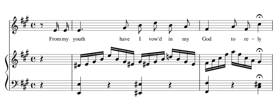
In a similar way, the music is unashamedly Euro-American, having a diatonic melody (based on the Western scale) and a steady march-like pulse. The melody’s triadic motifs (centred around an arpeggio) sound fanfare-like (see figure 3). 

Figure 3: ‘The Fugitive’s Song’: first verse, second line.

These patterns also have connotations of national anthems: the style of the music here corresponds with the patriotic lyrics. National anthems were becoming more significant in the increasingly nationalistic nineteenth century and they often used fanfare-like motifs. (9) As F. Gunther Eyck writes in his study of national anthems, they were based on concepts from the romantic movement, including ‘the search for symbols, religious revivalism, and an emotional rather than a rational approach to contemporary issues’. (10) ‘The Fugitive’s Song’, like national anthems of the day, encouraged an emotional, and indeed religious, engagement, ostensibly in the fight against slavery, but also in nationalistic feeling. Just as the words’ intertextual references to other patriotic verse incited the listener or singer to a sense of patriotic zeal, so musical symbols, or leitmotifs, such as fanfare-like calls, allowed association with a nation’s triumphant battle fanfares. (11) This interaction with other snippets of music works in a similar way to the interpictoriality of imagery and the intertextuality of texts. As in art and literature where viewers and readers see references to other works, so also in music, aural memory inescapably draws allusions to other music, the listener (or performer) making connections outside of the song itself. This is therefore a musical version of the interplay that illustration has with other images. Julia Thomas, writing on illustration and its relationships with text and other imagery, terms this ‘affillustration’, where illustration:

makes meanings not just in its (conscious and unconscious) references to other illustrations, but also in the groupings and clusters it generates, the ‘networks’ that exist within and across the boundaries of the illustrated text. (12)

Music, therefore, like illustration, is a ‘social genre’: both the ‘Star Spangled Banner’ and ‘La Marseillaise’ have similar triadic melodic motifs allowing listeners and performers to make connections between them and ‘The Fugitive’s Song’. The music’s martial 4/4 time also aligns it with other nationalistic songs, many of which were used during battles to rouse soldiers in patriotic fervour. Recognisable patterns in rhythms and melodies meant that they could be picked up easily and sung together. Indeed, as sociomusicologist Simon Frith points out, music is uniquely able to create a feeling of ‘spontaneous collective identity’ and ‘personally felt patriotism’. (13) Using such familiar methods in the music  ̶  and lyrics  ̶  of ‘The Fugitive’s Song’ encouraged engagement and a feeling of camaraderie which was a feature of patriotic music. As antislavery ideals became an identifying feature of the Northern states prior to (and during) the Civil War, these musical and language techniques furthered the sense of the North as synonymous with freedom for all.

The cover illustration uses Douglass’s figure to further associate the song with him and his antislavery mission. As the most photographed man of the nineteenth century, Douglass would have been recognisable by many (see figure 4). (14, 15)
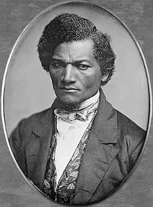
Figure 4: Daguerreotype of Frederick Douglass. Samuel J. Miller, American, 1822-1888, The Art Institute of Chicago (16)

Indeed, his depiction as face on to the viewer, allows immediate identification from his features and distinctive hair. The cover also references Douglass’s story: the Ohio River behind Douglass provides a physical symbol of the separation of North and South. The frozen Ohio River was famously crossed by Margaret Garner and her fellow fugitives in 1856 (see figure 5).
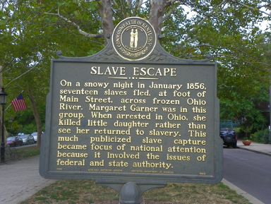

Figure 5: Memorial Marker, Covington, Kentucky. Photo credit: J. Stephen Conn, ‘Slave Escape Historical Marker’ by J. Stephen Conn is licensed under CC BY-NC 2.0.

The sign indicating New England is also mirrored by Douglass’s pointing finger, referencing his escape from Maryland to Massachusetts. (17)

Crossing the Ohio River symbolised an escape to freedom for many enslaved people. The illustration also therefore seeks to emulate a slave narrative whilst simultaneously glorifying the Northern states. Pictorial references to New England here serve to substantiate the song as an accurate account of Douglass’s experiences, whilst also underpinning the patriotism of the lyrics.
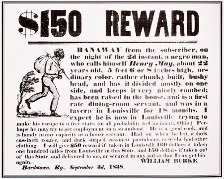
Figure 6: Runaway advert broadside. Woodcut and letterpress, broadside offering reward for escaped slave named Henry May, posted by William Burke, Bardstown, Kentucky, 3 September 1838. Courtesy, Harvard Fine Arts Library, Digital Images and Slides Collection.

Yet, Douglass’s pose has a more complex frame of reference with a dual heritage of North and South. It is similar to the figures of fugitives on the many Southern posters and press adverts for runaways, such as this one from the same year as Douglass’s escape, 1838 (figure 6). However, this allusion does not undercut the patriotism of the lyrics and music. Northern American arrogation and adaptation of this image shows the North’s moral distance from the South, ironically using a Southern image to expose the inhumanity of the South. Indeed, Marcus Wood, who has written extensively on representations of black people in visual culture,  claims that not only was it used in Southern runaway advertisements, but the image was also appropriated for use in slave narratives and early British abolitionist literature. (18) Similarly, American and African American literature specialist, Martha Cutter notes how antislavery illustrations were reworked and reused in other abolitionist literature, repurposing them as emotive antislavery imagery. (19) Here, the martyrologising of a Southern motif reveals the polysemous nature of imagery and how readings of illustrations could be adapted so that they functioned in diverse ways in different circumstances. (20) Indeed, such affillustrative references to both Southern imagery and Douglass’s story would have allowed purchasers of the song to divine its significance as part of Douglass’s heritage. Yet, such understanding is complicated by the cover’s specific geographic symbols, implying rather that it was not who escaped but where he escaped to that is important. 

‘The Fugitive’s Song’ was therefore written to appeal to a predominantly white audience, presenting a whitened version of Douglass’s story. Whilst the three media apparently portray an authentic account, requisitioning Douglass as figurehead is evidence of the somewhat peremptory nature of nineteenth-century Western advocacy for the voiceless African American. Perhaps this is an early example of the ‘mischief’ of Douglass’s later complaint. Indeed, reusing nationalistic motifs in all three media that underline the North’s importance in Douglass’s escape seem somewhat self-congratulatory. The three media of this song together reveal some of the complexities of nineteenth-century attitudes about slavery as connected with race and the significance of patriotism in American abolitionism. Therefore, studying the illustrations of illustrated songs in connection with their music and lyrics opens up new channels of dialogue around how issues, particularly difficult ones such as slavery, were, and are, negotiated.

(1) A. Hyatt King, ‘English pictorial music title-pages 1820-1885: Their style, evolution, and importance’, The Library, 4 (1950): pp. 262-272, p. 270.

(2) Charles H. Nichols, ‘Who Read the Slave Narratives?’ The Phylon Quarterly, 20: 2 (1959): pp.149–162, p. 153.

(3) Jesse’s brother John also sang ‘The Fugitive’s Song’ at Douglass’s funeral in 1895. See ‘Washington Talk Briefing: The Hutchinson Family’, The New York Times, 21 September 1987, p. 8. <https://www.nytimes.com/1987/09/21/us/washington-talk-briefing-hutchinson-family.html&gt; [accessed 23 January 2019].

(4) ‘Songs Against Slavery Used as Tool for Abolition’, Voice of America, 13 January 2014 <https://www.voanews.com/a/songs-against-slavery-tool-for-abolition/1829393.html&gt; [accessed 24 January 2019]. They also toured with the black Luca family although this was sometimes frowned upon, see Eileen Southern, The Music of Black Americans: A History (1971; New York: W. W. Norton & Company Inc., 1997), p. 107.

(5) Scott Gac, Singing for Freedom: The Hutchinson Family Singers and the Nineteenth-Century Culture of Reform (New Haven: Yale University Press, 2007), p.4.

(6) Frederick Douglass, ‘What the Black Man Wants’, Speech at the Annual Meeting of the Massachusetts Antislavery Society in Boston, April 1865 http://utc.iath.virginia.edu/africam/afspfdat.html [accessed 30 May 2019].

(7) These lyrics were written in 1798 by Joseph Hopkinson. The repeated references to freedom (which applied to freedom from the British) are particularly multivalent.

(8) The poem, which was later set to John Stafford Smith’s melody, was adopted as the national anthem for the United States on 15 April 1929. ‘The Designation of the “Star-Spangled Banner”’, 3 March 1931, History, Art and Archives: United States House of Representatives https://history.house.gov/Historical-Highlights/1901-1950/The-designation-of-the-%E2%80%9CStar-Spangled-Banner%E2%80%9D/#:~:text=The%20Congressman%20passed%20away%20before,introduced%20to%20the%20House%2C%20H.R. [accessed 07 February 2022].

(9) See Paul Nettl, trans. by Alexander Gode, National Anthems (1952; New York: Frederick Ungar Publishing, 1967).

(10) F. Gunther Eyck, The Voice of Nations: European National Anthems and Their Authors (Westport, CT: Greenwood Press, 1995), pp.xiii-xiv.

(11) A leitmotif is a recurrent musical theme associated with a particular idea, place or character. Eyck makes the point that in ‘almost every case, musical composition postdated the creation of the stanzas’, suggesting that composers used word painting and implying that this developed into the use of symbols to paint lyrics that were similar in many types of nationalistic verse writing. Eyck, The Voice of Nations, p.xv.

(12 ) Julia Thomas, Nineteenth-Century Illustration and the Digital: Studies in Word and Image (Basingstoke: Palgrave Macmillan, 2017), p.97.

(13) Simon Frith, ‘Towards an aesthetic of popular music’ in Richard Leppert and Susan McClary (eds.), Music and Society: The Politics of Composition, Performance and Reception (1987; Cambridge: Cambridge University Press, 1989) p.141.

(14) Autumn Haag, University of Rochester’s Special Collections librarian, describes Douglass as also ‘really aware of his self-image’ in Daniel J. Kushner, ‘Rare sheet music inspired by Frederick Douglass obtained by UR’ https://rocdouglass.com/2018/08/11/rare-sheet-music-inspired-by-frederick-douglass-obtained-by-ur/ [accessed 25 January 2019].

(15) For more on this, see John Stauffer, Zoe Trodd, Celeste-Marie Bernier, Picturing Frederick Douglass: An Illustrated Biography of the Nineteenth Century’s Most Photographed American (New York: Liveright Publishing Corporation, 2015).

(16) Daguerreotype of Frederick Douglass https://commons.wikimedia.org/wiki/Frederick_Douglass#/media/File:Frederick_Douglass_by_Samuel_J_Miller,_1847-52.jpg [accessed 30 March 2022].

(17) The Ohio River was considered the extension of the division between North and South, the Mason-Dixon line, here separating Maryland in the South and Pennsylvania in the North.

(18) Marcus Wood, Blind Memory: Visual Representations of slavery in England and America 1780 – 1865 (Manchester: Manchester University Press, 2000), pp.78-142. 

(19) Cutter charts the reworking of an image of a white man whipping a slave woman and child originally from the American Antislavery Almanac for Henry Bibb’s slave narrative, Narrative of the Life and Adventures of Henry Bibb in 1849, for example in Martha J. Cutter, The Illustrated Slave: Empathy, Graphic Narrative, and the Visual Culture of the Transatlantic Abolition Movement, 1800-1952 (Athens: University of Georgia Press, 2017), p.167.

(20) Copyright laws were principally to protect literary works rather than this type of imagery, Copyright Timeline: A History of Copyright in the United States http://www.arl.org/focus-areas/copyright-ip/2486-copyright-timeline#.W5uTHuhKjIU [accessed 14 September 2018].

“With feelings which I cannot describe”: How Illustrators of Fin-de-Siècle Romance Fiction Depicted Wonders Surpassing Human Description

by Kate Holterhoff

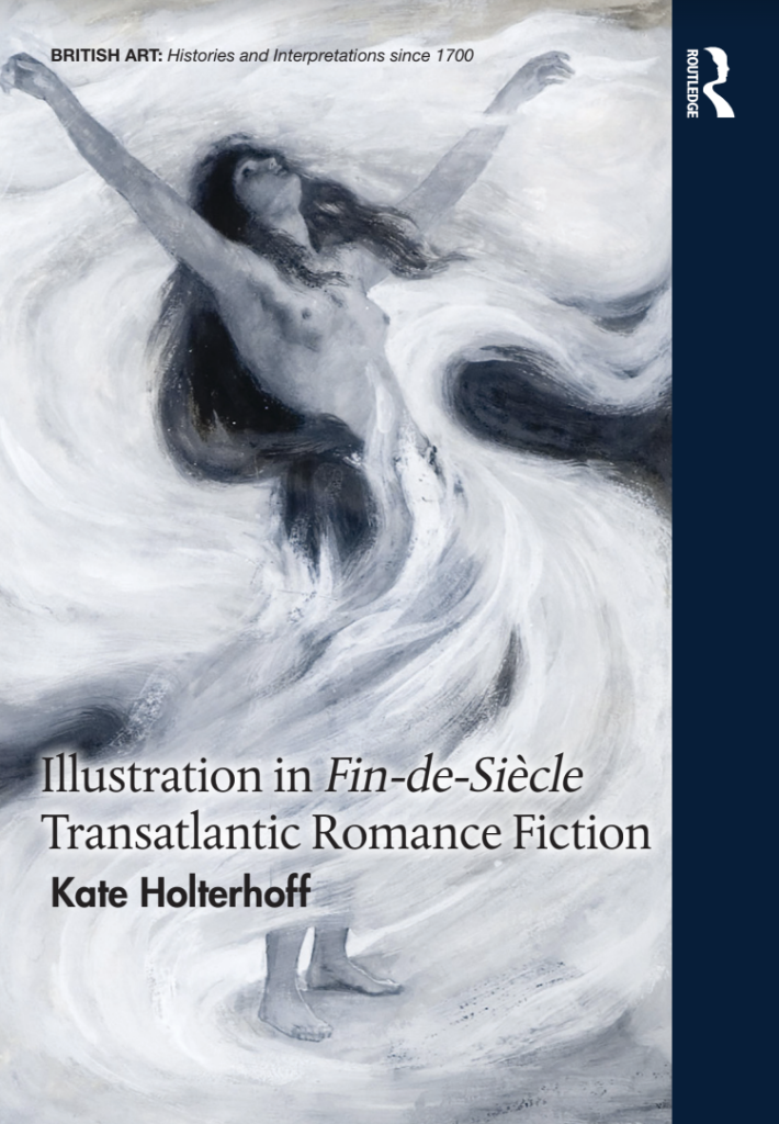
Kate Holterhoff received her doctorate from Carnegie Mellon University and is currently an Affiliated Researcher at the Georgia Institute of Technology. Her new monograph, Illustration in Fin-de-Siècle Transatlantic Romance Fiction (Routledge, 2022) is available now.

This post contains excerpts from the Introduction of Kate’s monograph.

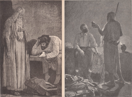
Figure 1. (Left) E. K. Johnson, “I took this cold fragment of mortality in my hand, and looked at it in the light of the lamp with feelings which I cannot describe” from She, A History of Adventure by H. Rider Haggard in The Graphic, 34, no. 883 (30 October 1886): 469. 
(Right) Charles Kerr, “Holly and Billali” from She, A History of Adventure by H. Rider Haggard (London: Longmans, Green, and Co., 1912): 110.

Although horrors and wonders exceeding the bounds of human perception and understanding were conventional in late-Victorian and Edwardian romance fictions, the illustrations which appeared beside these marvels suggested that, when it comes to visual paratexts, quite the opposite was thought to be the case. When fin-de-siècleillustrators undertook the task of illuminating moments that novelists left opaque, artworks challenged these wonders’ supposed inexpressibility. Illustrations from many of the most popular and wild-minded fictions published between 1885 and 1920 round out the reader’s aesthetic, narrative, cultural, and emotional experience, and therefore can never be mimetic reflections of authorial intent. 

Both realist and romance fictions were illustrated during the late nineteenth century for their initial serializations, but there is good reason to focus on romance illustrations particularly. The Romance Revival was tremendously visual, not only because of illustration’s ubiquity, but also owing to the type of wonders described. Readers were struck by romance fiction’s spectacles, which profoundly surpassed reader’s lived experiences. Robert Louis Stevenson points to the form’s optic qualities in “A Gossip on Romance” (1882), explaining that a good story must “repeat itself in a thousand coloured pictures to the eye.” (1) Tableaus of wonder made deep and lasting impressions upon audiences. Indeed, Graham Greene notes that H. Rider Haggard’s fictions “fixed pictures in our minds that thirty years have been unable to wear away.” (2)] The illustrations which accompanied these fictions did more than mimetically reproduce romance’s visually impressive supernatural wonders, advanced technologies, violent battles, great feats of heroism, and titillating romantic trysts. By engaging the notion of inexpressibility, these graphic paratexts deepen romance fiction’s plots. 

In H. Rider Haggard’s She (1887), for instance, narrator Horace Holly and his adult ward Leo Vincey journey to darkest Africa in search of the immortal and supernaturally powerful Queen Ayesha, or She-who-must-be-obeyed. Although wonders and adventures occur throughout, one of the most frequently illustrated portions of She shows Holly pondering a white, mummified foot (see fig. 1). This dismembered and perfectly preserved appendage is all that remains of a beautiful mummy that Billali, the adventurers’ Amahagger guide to Ayesha’s kingdom of Kôr, had become enamored with in his youth. In fact, it was Billali’s mother who burned all but this mummy’s extremity to end her son’s unnatural infatuation. After learning the foot’s remarkable history Holly explains that he, “took this cold fragment of mortality in my hand and looked at it in the light of the lamp with feelings which I cannot describe, so mixed up were they between astonishment, fear, and fascination.” (3) This supernaturally unspoiled foot—its appearance, materiality, and history—resonates so deeply with Haggard’s narrator that verbalizing, or even processing, his complex emotions becomes impossible. It touches on something much deeper than horror or antiquarian interest. Although Haggard leaves the substance of the foot’s mystery open to the interpretation of readers, artists beginning with E. K. Johnson (illustrator for The Graphic and Harper’s Weekly’s serializations), and followed by Charles Kerr (co-illustrator with Maurice Greiffenhagen for the 1888 Longmans, London, book edition), have sought to convey its power and seductiveness. 

What made Haggard’s illustrators not only willing, but also eager, to show a marvel that Haggard will not, and Holly “cannot describe”? Rendering indescribable scenes like this eerie drama in She, but also includingfictional technologies, lands, creatures, peoples, and circumstances graphically allowed these artists to add both concrete detail and greater mystery to these incredible stories. I focus on romance fiction because these texts were visualized despite, or perhaps because, authors explicitly wrestled with ideas of ineffability. Far from being put off by wild visions of terror and wonder, portraying incidents characterized as surpassing the author’s or narrator’s expressive abilities invigorated artists. Whether on purpose or accident, by including indescribable marvels authors granted their illustrators near total liberty to fill in gaps in the reader’s understanding. These unimaginable moments permit word and image to labor hand-in-hand, deepening the audience’s engagement with a text’s more profound themes. 


My monograph Illustration in Fin-de-Siècle Transatlantic Romance Fiction (2022) sets out to investigate the literary, historical, cultural, and aesthetic clues illuminating how images in late-nineteenth and early-twentieth-centuryBritish and American romance fiction enabled artists to visualize wonders thought to surpass human description. In the process, I point to the innovative collaborations that authors, illustrators, and publishers forged to describe the ostensibly ineffable. The book is divided into five chapters focusing on a single author, genre, and theme. Each begins with a broad history of illustration within the genre, but then focuses on one canonical late-nineteenth-century author as a case study. Chapter one examines how unimaginable because bygone eras appeared in Robert Louis Stevenson’s historical romances Treasure Island and The Black Arrow. Chapter two examines the pictorially-resistant convention in children’s fiction of expressive animals in Rudyard Kipling’s “Her Majesty’s Servants,” “Toomai of the Elephants,” and “How the Camel Got His Hump” (two stories from The Jungle Books and one from the Just So Stories, respectively). The third chapter explores several indescribably powerful and sexually alluring African women from H. Rider Haggard’s adventure fictions, focusing particularly upon the characters of Nanea from Black Heart and White Heart, Maiwa from Maiwa’s Revenge, and Ayesha as she appears in the She franchise. Chapter four surveys and assesses pictures of incredible technologies from several of H. G. Wells’s fictions, including “In The Abyss,” The War of the WorldsWhen the Sleeper Wakes, and A Story of the Days to Come. Fanciful machines often defy description, either owing to the narrator’s inability to characterize them faithfully, or else because they were too advanced to describe using nineteenth-century analogies. The final chapter examines illustrations that engage the unspeakable horror of cannibalism conducted by and upon supposedly civilized white persons, looking especially at Harper’s Weekly’s serialization of James De Mille’s imperial Gothic romance A Strange Manuscript Found in a Copper Cylinder

Illustration in Fin-de-Siècle Transatlantic Romance Fiction studies illustrations created to enhance romance fiction plots incorporating magic, technology, desire, violence, and other marvels that thwart written representation because these multimodal texts provide illustrators with the dual burden and opportunity of visualizing unspeakable ideas. I endeavor to better understand the complex bonds joining word to image in order to plumb what romance illustrations of indescribable marvels can, and do, accomplish.

(1) H. Rider Haggard, She, ed. Andrew M. Stauffer (Peterborough: Broadview, 2006), 117

(2) Robert Louis Stevenson, “A Gossip on Romance,” Longman’s Magazine 1 (November 1882): 69.

(3) Graham Greene, Collected Essays (New York: The Viking Press, 1969), 209.

Printed Afterlives: Joshua Reynolds’ ‘Johnson Arguing’ portrait, 1769

by Miriam Al Jamil

Miriam Al Jamil is an independent researcher, with interests in eighteenth-century sculpture, material culture, and women’s history. She has published reviews and essays on online platforms and in academic journals including the Journal for Eighteenth-Century Studies, Studies in Religion and Enlightenment, and Early Modern Women. Her chapter on a Zoffany painting appeared in Antiquity and Enlightenment Culture: New Approaches and Perspectives (Brill, 2020). She is the Fine Arts review editor for BSECS Criticks, chair of the Burney Society UK, and is active in the Johnson Society and Women’s Studies Group, 1558-1837. 


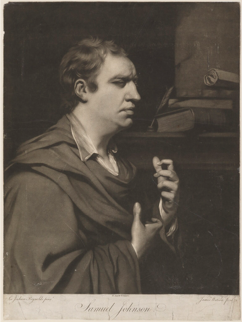
One of the best-known portraits of Samuel Johnson by Joshua Reynolds entered the collection of the 3rd Duke of Dorset at Knole in Kent after its exhibition at the Royal Academy in 1770. Often styled ‘Johnson Arguing’, the portrait rapidly deteriorated, ‘the face cracked, the shadows damaged by bitumen’, due to Reynolds’ experiments with untested media. (1) As a result, the details of the painting are better appreciated from the 1769 mezzotint (figure 1) by James Watson (1740-1790). (2) Mark Hallett notes that ‘Johnson’s portrait offers an especially startling depiction of heightened, active introspection, conveyed most powerfully by his half-closed eyes and by the hands that claw the air as if grappling with, or playing on, an especially complex set of concepts.’ (3) The hands add tension to the portrait, capturing a moment when the whole body engages with a critical point in his thought process. However, the combination of an idealised, classicised Johnsonian face with strangely distorted and twisted hands has troubled commentators ever since it was first shown, the ‘hands raised and bent in a peculiar manner’. (4) Watson’s print is unusual among the variety of subsequent engraved copies featuring the face alone which form the subject of this essay.


Figure 1. James Watson, Samuel Johnson, 1769, mezzotint. National Portrait Gallery, NPG D36536.

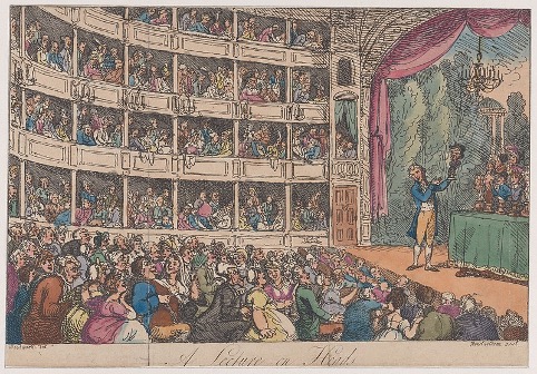
The vocabulary of gesture and representation of the passions through facial expression was the subject of illustrated treatises which proliferated from the seventeenth century to inform and guide both artists and actors, lawyers and preachers, all of whom depended on public performance to some extent in their professions. (5) At a popular level, George Alexander Stevens published his ‘A Lecture on Heads’ in 1765, based on his demonstrations which used a range of busts as props to illustrate and satirise popular character stereotypes (see figure 2). 

Figure 2. Thomas Rowlandson after George Murgatroyd Woodward,
Frontispiece, from “A Lecture on Heads” by George Alexander Stevens, 1808, print. Metropolitan Museum of Art.
 

Stevens describes ‘The Learned Critic, or Word-grabber’: ‘This is a true classical conjugating countenance, and denotes dictionary dignity […] the ears of this critic are immensely large; they are called trap doors to catch syllables![…] his eyes are half closed; that’s called the Wiseman’s Wink; and shews (sic) he can see the world with half an eye.’ (6) Most interpretations of the half-closed eyes in Johnson’s portraits tend to point either to his disability directly or to his introspection rather than to shrewd engagement with the world. Stevens’ idea poses the possibility of an alternative and artful evaluation of Johnson’s half-closed eyes in the Knole portrait. Johnson might have enjoyed the epithet ‘Wiseman’s wink’.

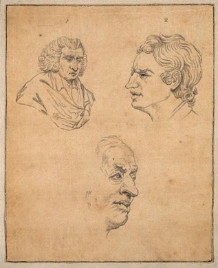
The most influential contemporary analysis of gesture and appearance was one cited by James Boswell who listed all the known portraits of Johnson in a footnote to his Life of Johnson (1791). (7) These include one published in John Caspar Lavater’s Essays on Physiognomy (1789-98), ‘in which Johnson’s countenance is analysed upon the principles of that fanciful writer’. (8) The Knole portrait provided the most fruitful source for Lavater’s examination of Johnson’s character based on facial expression and physical peculiarities. The engraver Thomas Holloway (1748-1827) furnished many of the 800 illustrations to Henry Hunter’s translation of Lavater of 1789. His three Johnson portraits are pared down and simplified in line, combined on the page to enable subtle interaction in an exploration of the portrait subject (figure 3).

 Figure 3. Lavater, Samuel Johnson: Three Portraits, c.1789. Wellcome Library no. 28706i.

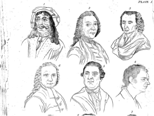
Thomas Holcroft’s translated edition of Lavater’s essays uses another engraving of the Knole portrait which has been divested of its introspective ‘wrestling’ altogether (figure 4). The description adds a further interpretation of Johnson’s expression, ‘the most unpractised eye will easily discover, […] the acute, the comprehensive, the capacious mind, not easily deceived, and rather inclined to suspicion than credulity’. (9) An appended essay in this edition by essayist Helfrich Peter Sturz (1736-1779) asserts that ‘Dr. Johnson had the appearance of a Porter; not the glance of the eye, not any trait of the mouth, speak the man of penetration, or of Science.’ (10) He continues, ‘Can a countenance more tranquilly fine be imagined, one that more possesses the sensibility of understanding, planning, scrutinizing? In the eyebrows, only, and their horizontal position, how great is the expression of profound, exquisite, penetrating understanding!’. (11) For Sturz, the character is belied by his attire. His assessment incorporates his familiarity with anecdotes about Johnson’s habitually dishevelled dress although the print itself does not include any evidence to support his analogy. An imagined substitution for the classical robe of Reynolds’ original painting enables the print to become a convenient signifier of Johnson, the man remembered by his friends.

 
Figure 4. From Lavater, Essays in Physiognomy, translated from the German by Thomas Holcroft. London: Ward, Lock & Co., undated), 17th edition. Plate 1, Nos. 3 and 4, p.33.

The portrait at Knole drew both visitors and copyists. One of these was Ozias Humphry (1742-1810), a skilled miniaturist who received the patronage of the 3rd Duke. He wrote about meeting Johnson sometime between 1764 and 1772: ‘I was very much struck with Mr. Johnson’s appearance, and could hardly help thinking him a madman for some time, as he sat waving over his breakfast like a lunatic. He is a very large man, and was dressed in a dirty brown coat and waistcoat with breeches that were brown also (though they had been crimson), and an old black wig.’ (12) Like  Sturz, Humphry went on to describe how the peculiarities of the man had ill-prepared him for the brilliant intelligence that he then witnessed in action. He painted at least one portrait of Johnson. Boswell listed ‘a beautiful miniature in enamel’ but some of his later work has been lost. (13)

A 1918 biography of Humphry includes a copy of an etching of Johnson’s head taken from the Knole portrait, reputedly based on a drawing by Humphry. The etching is described, ‘From the rare etching after Humphry by Mrs. D. Turner, Original Unknown’. (14) Before 22nd July 2021, the National Portrait Gallery website attributed the print to Mrs. D. Turner, based on this information. This attribution has now been removed, following my query, in favour of Samuel James Bouverie Haydon (1815-1891). (15) However, the NPG continues to list an etching by Mrs. D. Turner c.1825, based on a crayon copy by Humphry but it is not illustrated or part of the gallery’s collection. (16) She did indeed make an etching of Johnson, but it was not the one cited in Humphry’s biography or originally by the NPG.

Mary Dawson Turner was born Mary Palgrave in Norfolk, in 1774. She married the banker, botanist, antiquarian and collector Dawson Turner in 1796, with whom she lived in Great Yarmouth and had eleven children, eight of whom survived into adulthood. (17) Dawson Turner’s extensive collections have received scholarly attention over the years. In the Preface to his Manuscript Library sale of 1859, he is described as ‘an accomplished scholar, a man of very varied attainments, and of accurate observation […], deriving his solace and delight alike from pursuits connected with the fine arts and archaeology’. (18) He arranged tuition in drawing and engraving for Mary and their six daughters whose subsequent industry and dedication to the production of illustrations for his books and projects both amazed and unsettled visitors to their home. Their contributions to his work and reputation have only recently been acknowledged and examined in a collection of essays published in 2007. (19)

The collector’s family life appears close; he loved, respected and was proud of his wife and children. However, I suggest that the intensive application to their studies required of the children and the daily labour of etching from 6.30 in the morning undertaken by Mary and her daughters betokens something more obsessive in an ostensibly benign patriarchal home. Alluding to a visit to London by her daughter Ellen, Mary expressed concern over her rigorous studies, ‘I certainly think that her less comparatively sedentary habits and strenuous application of mind will probably be [more] friendly to her general health than those she addicted herself to at home’. In the same letter, Mary describes one of her own etching subjects as ‘drudgery’ from which she needed ‘some precious rest to the eyes and pleasure to the mind’. (20) This feverish labour is the context in which Mary etched her print of Dr. Johnson.

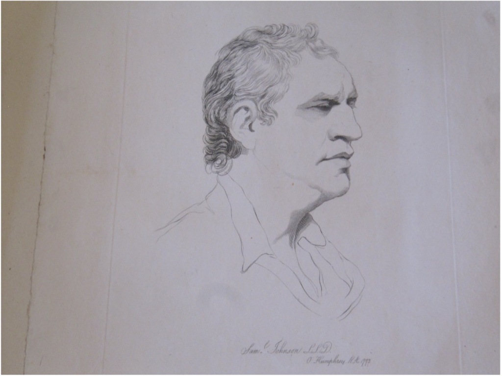
Dawson Turner’s ‘grangerised’ volumes of James Boswell’s Life of Samuel Johnson (1791) are all now lost. These consisted of two sets of four volumes which were each made into six large imperial folio volumes, with around 1,700 portrait prints, views of locations mentioned in the text, news cuttings and autographs. It is likely that Mary’s etching of Johnson was destined for one of these volumes. Mary mentions her efforts to complete it in a letter of 1825. The cares of her household and large family and her own fragile health clearly interfered with the relentless etching programme which demanded her attention. She writes, ‘I have been so variously engaged today with perpetual calls for directions to whitewashers, whitesmith masons & etc. that I have not done Dr, Johnson’s head’. (21) An unpublished volume, of which only forty-nine copies were made, One Hundred Etchings by Mrs. Dawson Turner, includes Mary’s etching, ‘Johnson, Samuel LL.D, from a drawing by Ozias Humphry R.A. 1773’. (22) It is a disciplined and technically exact copy which was reproduced in other Dawson Turner print albums.

Figure 5. Mary Dawson Turner, Samuel Johnson, after Ozias Humphry, 1773
The Mother’s Exemplar, being a collection of Etchings, many of them from Original Drawings by Mrs. Dawson Turner and her family
V&A Prints and Drawings, 93 H/19.

In her study of eighteenth and nineteenth century-extra-illustrated books, Lucy Peltz identifies many cases where fathers and daughters undertook such an activity together. In the Turner family, she suggests, it was ‘a domestication of the intellectual sociability of the masculine club’ which gave the daughters ‘access to a traditionally male arena’ and ‘strengthened sentimental bonds between relatives’. (23) Such a bond is evident particularly in correspondence from Harriet Turner to her father which centres on the art she has seen and the subjects she has produced as drawings and etchings. Her enthusiasm is undeniable, but she is passionate and needy, longing for his approval and affection, even after she has married and moved away. (24) The illustrations chosen for inclusion in Turner’s volumes depended largely on the creative production of the Turner women over many years, a more demanding commitment than the leisurely and companionable selection of relevant prints from other sources which is suggested by Peltz’s statement.

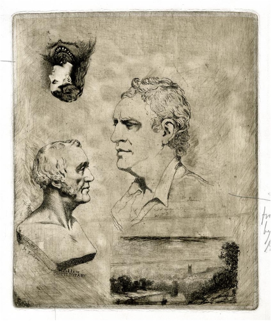
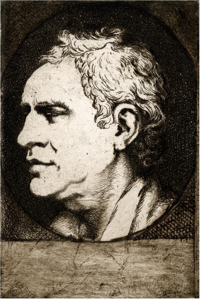
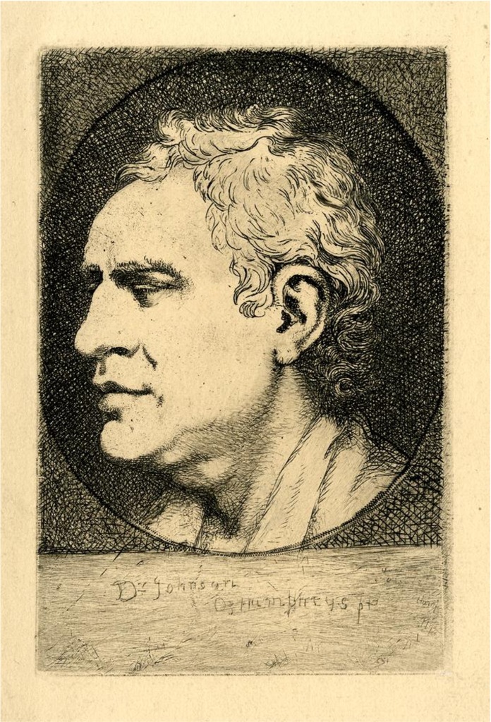
The inaccessibility of both Mary Turner’s print and of the lost Humphry drawing upon which it was based led to confusion over the attribution for another print, ostensibly after the same Humphry drawing. Samuel James Bouverie Haydon (1815-1891), print-maker and sculptor, made his etching of Johnson in 1860. Unlike Mary Turner, he did not alter the reverse image. The process of making his print is evident in plates held by the British Museum. He etched an early version on a large 32cm high plate, alongside trial etchings of a bust of John Dickens, a portrait of his daughter and a small landscape (figure 6). (25 ) He then trimmed the portrait down and added an oval frame which was probably close to the format of the original Humphry miniature portrait (figure 7). (26) He later burnished out and replaced the lettering on the earlier plate (figure 8). (27)


Figure 6. Samuel James Bouverie Haydon, etching on copper, c.1860, 320 x 265mm. British Museum, No. 1924,0512.18

Figure 7. Haydon, Portrait Head of Dr. Johnson, c.1860., 174 x 115mm. British Museum, No. 1832,0507.30.

Figure 8. Haydon, Portrait of Samuel Johnson, c.1860, 176 x 116mm, British Museum. No. 1913,0611.122. 

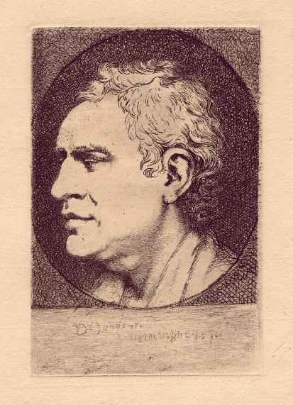
Another print of this final version is the one in the NPG collection (figure 9). (28) A comparison with Mary Turner’s print highlights Haydon’s dense and less formal cross-hatching of the background to deepen the contrast to the face, and his spare treatment of the hair with less expressive line and a consequent lack of movement and flow.


Figure 9. Haydon, Samuel Johnson, National Portrait Gallery, 283 x 203mm, NPG D3158.

The reason that Haydon undertook the etching is not known. He worked at his home in Exeter and in London. (29) He regularly exhibited at the Royal Academy from 1840 until 1876 and combined his traditional artistic practice with the pioneering medium of photography from 1845, when he worked as an assistant to William Fox Talbot. His academy exhibits reflect commissions for civic, ecclesiastical, military and aristocratic portrait busts, classical and sentimental subjects, and paintings of town and country locations. (30) The variety of his subjects point to an artist who adapted to the economic imperatives of the market, and though not universally celebrated, at least he made a living through his craft. The four trial etchings together on his plate summarise the diversity of the media he employed. In this context, Johnson’s head becomes inextricably linked with the cultural and commercial conditions of nineteenth-century London.

Unlike Haydon, Mary Turner and her daughters worked solely on Dawson Turner’s projects, never exhibited their art at public exhibitions and do not appear to have aspired to general artistic recognition. However, Jane Knowles in her essay on the Turner family identifies a hint of regret in one of Elizabeth Turner’s letters, ‘We can copy & that is all. And Mr. Varley’s kind efforts & example have only show’d to prove to us the strong line of demarcation which separates the artist from the draftsman’. (31) Knowles suggests that Dawson Turner regarded them as copyists, as merely ‘artistic’ rather than ‘artists’, who were never expected to develop an individual style. Maurice H. Grant, in his  A Dictionary of British Etchers (1952) is dismissive about Mary, ‘all competent little Plates without much finesse but firmly etched somewhat in the Netherlands tradition’. (32) Likewise, his entries for the Turner daughters are perfunctory, ‘They chiefly employed themselves in copying the sketches of J.S. Cotman, their instructor, but their several works are not now distinguishable’. (33) A recent dictionary of print-makers does not include etchers so fails to mention the Turners at all. (34) It is not surprising that Mary Turner’s etching of Johnson has been forced back into obscurity and inaccessibility and her name incorrectly attached to another artist’s work. Technical skill and a trained eye are no substitute for creative response.

Footnotes

(1) David Mannings, Sir Joshua Reynolds: A Complete Catalogue of his Paintings (New Haven: The Paul Mellon Centre for Studies in British Art, Yale University Press, 2000), no. 1012, p.280.

(2) See Mark Hallett, Reynolds: Portraiture in Action (New Haven: The Paul Mellon Centre for Studies in British Art, Yale University Press, 2014), p.242; James Watson, Samuel Johnson, 10 July 1769, National Portrait Gallery, NPG D36536; see entry for James Watson in Oxford Dictionary of National Biography: https://www.oxforddnb.com/view/10.1093/ref:odnb/9780198614128.001.0001/odnb-9780198614128-e-28840?rskey=u5GJ4E&result=4 [accessed 18 November, 2021].

(3) Hallett, p.244.

(4) Edward Hamilton, A Catalogue Raisonné of the Engraved Works of Sir Joshua Reynolds, P.R.A, from 1755 to 1820 (London: Colnaghi & Co., 1874), p.32.

(5) For a full discussion of available treatises, see Adam Kendon, Gesture: Visible Action as Utterance (Cambridge: Cambridge University Press, 2004), Chapter 3.

(6) George Alexander Stevens, The Celebrated Lecture on Heads, which has been exhibited upwards of One Hundred Successive Nights, To Crouded Audiences, and Met with the most Universal Applause (London: Richard Bond, 1765), Part III, p.15.

(7) James Boswell, Life of Johnson unabridged (Oxford World’s Classics, Oxford: Oxford University Press, 1998), Monday 20 December, 1784, p.1395, footnote 1.

(8) Johann Caspar Lavater, Essays on physiognomy; designed to promote the knowledge and the   love of mankind, Illustrated by more than eight hundred engravings accurately copied; and some duplicates added from originals. Executed by, or under the inspection of Thomas Holloway. Translated from the French by Henry Hunter (London: John Murray [etc.], 1789-98), 5 Vols.; https://wellcomecollection.org/works/yffvbzu5 [accessed 18 November, 2021].

(9) Essays on Physiognomy: translated from the German of John Caspar Lavater, by Thomas Holcroft. Also One Hundred Physiognomical Rules, taken from a posthumous work by J.C. Lavater; and a Memoir of the Author, seventeenth edition; Illustrated with upwards of four hundred profiles (London: Ward, Lock & Co., undated), p.33.

(10) Ibid., p.257.

(11) Ibid., p.258.

(12) Quoted from letter, private collection, in George C. Williamson, Life and Works of Ozias Humphry, RA (London: John Lane, 1918), p.87.

(13) Boswell, p.1395, footnote 1.

(14) Williamson, List of Illustrations, p.xiv, and facing p.88.

(15) National Portrait Gallery, NPG D3158.

(16) See National Portrait Gallery, https://www.npg.org.uk/collections/search/portraitExtended/mw03492/Samuel-Johnson#ref4  [accessed 12 October, 2021].

(17) Mary Dawson Turner (1774-1850), https://en.wikipedia.org/wiki/Mary_Dawson_Turner  [accessed 12 October, 2021]; see the Oxford Dictionary of National Biography entry for Turner, Dawson (1775-1858), https://www.oxforddnb.com/view/10.1093/ref:odnb/9780198614128.001.0001/odnb-9780198614128-e-27846 [accessed 12 October, 2021].

(18) Catalogue of the Important Manuscript Library of the late Dawson Turner, esq., formerly of Yarmouth […] to be sold by auction on Monday, June 6th, and following days’, Messrs. Puttick & Simpson, Auctioneers of Literary Property, 47 Leicester Sq., 1859, p.xvi.

(19) Nigel Goodman, ed., Dawson Turner: A Norfolk Antiquary and his Remarkable Family (Chichester: Phillimore, 2007).

(20) Trinity College Library, Cambridge, Dawson Turner Correspondence, Turner III, A33/42, Mary Turner to Dawson Turner, 5 April 1832.

(21) Dawson Turner Correspondence, Turner III, letter from Mary Turner, 19 April 1825.

(22) Turner, One Hundred Etchings by Mrs. Dawson Turner, Not published, [1830], British Library; other copies discussed by Warren R. Dawson, ‘A Bibliography of the Printed Works of Dawson Turner’, in Transactions of the Cambridge Bibliographical Society, (3:3, 1961), pp.232-256, 242.

(23) Lucy Peltz, Facing the Text: Extra-illustration, Print Culture, and Society in Britain, 1769-1840 (San Marino: The Huntington Library, 2017), p.313.

(24) See especially Dawson Turner Correspondence, Turner III, A8/1-35 Harriet Turner (Gunn) to Dawson Turner.

(25) Samuel James Bouverie Haydon, etching on copper, c.1860, 320 x 265mm, British Museum, No. 1924,0512.18 https://www.britishmuseum.org/collection/object/P_1924-0512-18 [accessed 29 October, 2021].

(26) Haydon, Portrait Head of Dr. Johnson, c.1860, 174 x 115mm, British Museum, No. 1832,0507.30 https://www.britishmuseum.org/collection/object/P_1932-0507-30 [accessed 29 October, 2021].

(27) Haydon, Portrait of Samuel Johnson, c.1860, 176 x 116mm, British Museum, No. 1913,0611.122 https://www.britishmuseum.org/collection/object/P_1913-0611-122 [accessed  29 October, 2021].

(28) Haydon, Samuel Johnson, National Portrait Gallery, 283 x 203mm, PG D3158. https://www.npg.org.uk/collections/search/portrait/mw37354/Samuel-Johnson?LinkID=mp02446&wPage=1&role=sit&rNo=39 [accessed 29 October, 2021]. My thanks to British Museum curator Hugo Chapman and National Portrait Gallery curator Paul Cox.

(29) For biographical details, see Mapping the Practice and Profession of Sculpture in Britain and Ireland, 1851-1951:https://sculpture.gla.ac.uk/view/person.php?id=msib7_1218129055 [accessed 7 November, 2021].

(30) See entries in The Royal Academy Summer Exhibition: A Chronicle, 1769-2018https://chronicle250.com/1840#catalogue [accessed 7 November, 2021].

(31) Elizabeth Turner, quoted in Jane Knowles, ‘A Tasteful Occupation? The Work of Maria, Elizabeth, Mary Anne, Harriet, Hannah, Sarah and Ellen Turner’, in Nigel Goodman, Dawson Turner, pp.123-140, p.136; reference is to John Varley, artist (1778-1842), acquaintance of the family.

(32) Col. Maurice Harold Grant, A Dictionary of British Etchers (London: Rockliff, 1952), p.207.

(33) Ibid., p. 208.

(34) See David Alexander, A Biographical Dictionary of British and Irish Engravers, 1714-1820 (New Haven: Yale University Press, 2021). Crome, Cotman and Varley, all associated with Dawson Turner, are included.

Introduction, Twitter launch and Call for Contributions

Hello and a very happy New Year to all members of the Romantic Illustration Network! My name is Katie Snow and I’m pleased to be the new web lead for the RIN. Lots has been happening behind the scenes at RIN, and in this post I’ll introduce myself, share our new Twitter account, and encourage submissions to the blog.

My work is best described as a mix of medical and art history; I use visual sources to explore attitudes towards bodies, gender and sexuality. At present, my research is focused on how the body – and especially its intimate parts – are politicised in British caricature. I’m writing my first monograph, Satirising the Breast, having been awarded a PhD on representations of breasts in Georgian satirical prints in the summer of 2021. I’m looking forward to seeing how my involvement with the RIN shapes my project, and would love to hear from members with similar interests.

For those of you who are active on social media, we’ve recently launched a RIN Twitter account which will act as a hub for exchanging ideas, sharing news and celebrating work. To help spread the news of our joining, please follow the account here, retweet posts and tag the RIN in items you think might be of interest to members. 

Over the coming weeks and months I’ll also be updating this website with information about upcoming events, partnerships and relevant publications, as well as sharing useful links to research, cultural and pedagogical platforms. Please get in touch if you would like to be added as a Member, have any suggestions for material to be included or if you would like to recommend a book or article to be added to the Bibliography page (don’t be shy about sharing your own!). 

Finally, I’d like to take this opportunity to invite ongoing contributions to the RIN blog. We welcome anything which might interest our diverse network of members: posts might, for example, take the form of a review of an event, text or media item; an exploration of a primary source; or serve as an introduction to a new research project. All topics related to visual culture in the Romantic period will be considered. The RIN endorses a broad definition of illustration, welcoming interdisciplinary approaches and international perspectives which bring together scholars working on poetry, prose, the printed book, paintings and other visual materials from roughly 1750-1850. Published posts will be shared on Twitter, as well as directly with our network members and partners. As an illustration network we are particularly keen to reinstate our popular Image of the Month series, which spotlights paintings, prints and other illustrations. Posts typically range from 500-3000 words. Previous Image of the Month publications can be viewed here: https://romanticillustrationnetwork.com/category/image-of-the-month/.

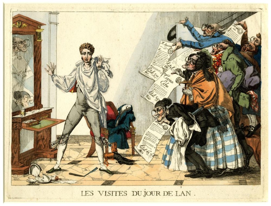
As the year unfolds, I hope you will consider submitting your suggestions and ideas to the RIN, and contribute to the exciting ongoing conversations in the field of Romantic visual culture. I’ll leave you with this satirical print of a young French man, whose festive extravagances catch up with him as creditors, rather than friends, come a-calling on the morning of New Year’s Day 1815…

Please get in touch with me at ks596@exeter.ac.uk

Les Visites du Jour de l’An (The New Year’s Day Visits). 1814. British Museum, Museum no. 2001,0520.72.

Queen Caroline in Caricature – August 1821

Caroline’s Death and an Unpublished George Cruikshank Image

Ian Haywood, University of Roehampton, London

Figure 1. George Cruikshank, Vox Populi, Vox Dei. Unpublished design for a caricature on the violence at Queen Caroline’s funeral. Berg Collection, New York Public Library. Author’s photograph.

Queen Caroline’s death was as controversial as her life. After more than a year of political upheaval and unprecedented media attention, Caroline passed away on 7 August 1821, aged 53. The medical cause of death was a digestive blockage, but Caroline’s followers saw things differently. In their eyes, she had died of a broken heart, the victim of a government-led campaign of persecution and vilification. She was the ‘injured’ queen to the very end. Only weeks earlier, on 19 July, Caroline had been barred from attending George IV’s coronation in Westminster Abbey, and this definitively un-queenlike humiliation was widely believed to have hastened her rapid demise, especially as she was already a weakened figure. The coronation debacle was the climax of a sustained propaganda counter-offensive which followed her stunning triumph in late 1820 (see the ‘November 1820’ blog). When Caroline failed to seize the political moment and bring the government down, her enemies made a concerted effort to shift public opinion against her by dwelling on eye-catching flaws: her sex life, her corrupt aristocratic lifestyle, and her departure from the moral codes of respectable femininity and the correct standards of royal conduct. As anti-Caroline caricatures flooded the market, her support wavered further when she accepted an increased allowance of £50,000, the same amount she had symbolically refused when she returned to England the previous year (see the ‘June 1820’ blog). But her death was an immediate and sensational rallying point for her supporters, an opportunity to retake the moral high ground and to dominate the media with tributes, commemorations, and accusations of foul play. The violence that erupted at Caroline’s funeral only confirmed the malign role of the government and its petty determination to deny her royal reputation and rights. The public outrage at this neo-Peterloo atrocity led to some memorable caricatures, including a striking unpublished design by George Cruikshank, which shows popular justice being meted out to a military officer (Figure 1).

To understand and appreciate this image more fully, we need to retrace our steps and look more closely at the explosion of print culture which followed Caroline’s death. As already noted, this was the moment to reverse the tide of negative reportage and visual propaganda which had dominated 1821 up to that point. In this loyalist counter-narrative, ‘Caroline the Curst’[1] was the antithesis of the indomitable, rebellious heroine of the radical imagination. Instead of Boadicea, she was Messalina, the infamous meretrix augusta or imperial whore’ of Juvenal’s Sixth Satire, an aristocratic Roman matron who supposedly slept with lower-class men to satisfy her insatiable sexual appetite.[2] According to one verse satire entitled Messalina, Caroline’s trial (which technically had found her guilty of adultery, though only by the slimmest of margins) ‘pronounc’d the queen / Had clearly a low trollop been’[3], a slur that evoked memories of the virulent lampooning of Caroline’s ‘butcher-kissing’ predecessor Georgiana, Duchess of Devonshire, another upper-class woman who dared to mix in public politics.[4] The accusation of demeaning promiscuity was also a metaphor for the greater offence of courting public opinion. Caroline had willingly turned herself into an ‘exhibit’ for public consumption, ‘courting the favour of a populace, whose breath is bought and sold’ instead of rededicating herself to her husband.[5] She was a triple offender, exposing her royal body indiscriminately to the disreputable gaze of lovers, radical politicians, and the masses. This multiple prostitution of her image was the focus of a series of high-quality caricatures published by George Humphrey in early 1821.[6]

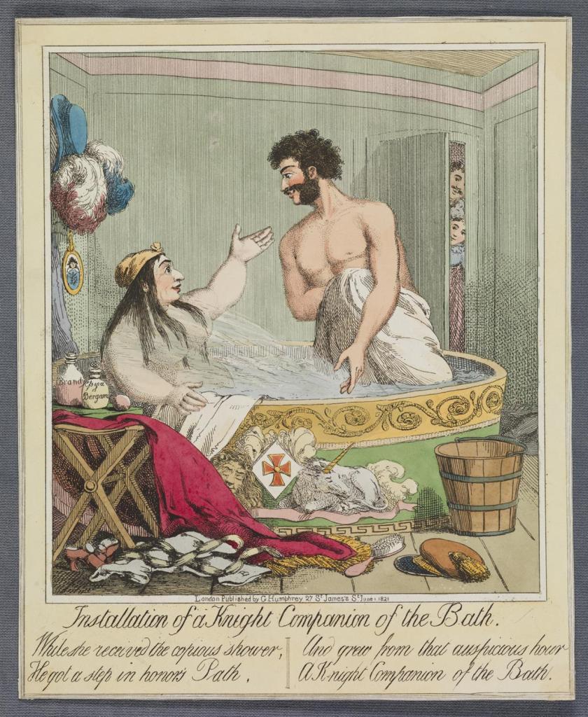
Two examples of these prints are included here (Figures 2-3). The title of Installation of a Knight Companion of the Bath (Figure 2) puns on Caroline’s promotion of Bartolomeo Bergami from servant to personal assistant. The chivalric title Knight of the Bath was normally awarded for outstanding military or diplomatic service, and not – as in this case – for sexual gratification. This scene illustrates one of the alleged examples of adultery which were recounted in fulsome, often risible detail at Caroline’s trial. Instead of the purifying bathing ritual of the original chivalric Order, we witness a Rowlandsonian erotic frolic in which Bergami’s orgasmic ‘copious shower’ expresses the sheer joy and guilt-free abandon of their relationship. This is indeed damning visual evidence of ‘low trollop’ behaviour, but as so often in caricature the scene is also full of mischievous satirical traps. Caroline’s opponents might well have gloated over this bathtub tryst, but they were also forced to confront the voyeuristic basis of their pleasure. In the background there is a partially open door which shows two servants who are spying on the lovers, and while this device may signify the authenticity of the eye-witness accounts, it is also a reminder of the prurient gaze of scandal which made Caroline’s trial simultaneously titillating and distasteful. This tainted gaze contrasts with the openly affectionate eye contact of the two lovers, and this juxtaposition could imply that Caroline’s accusers are both jealous and resentful of her sexual independence and – as represented by the discarded clothing – her contempt for convention. Another object which defies social and moral norms is the miniature portrait of Bergami which is hanging on the wall behind her head and which she wears openly and unashamedly in other prints. For viewers today, these complexities make this image far more challenging and rewarding than first impressions might suggest.

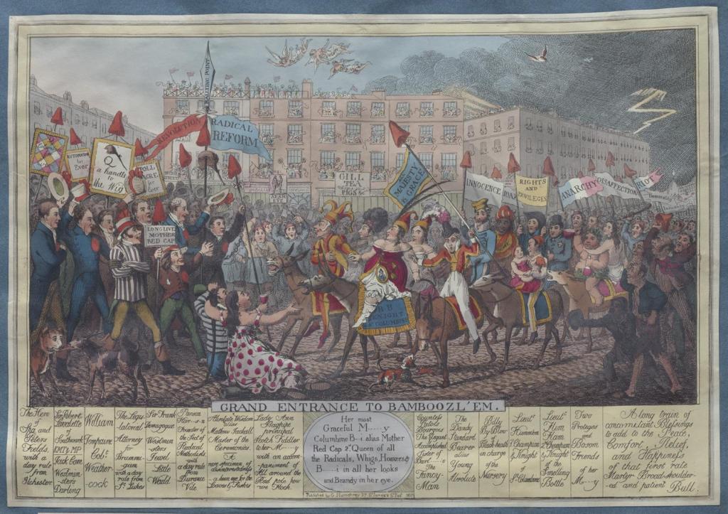
The second example from the Humphreys series switches the satirical focus from private to public indiscretion. Grand Entrance to Bamboozl’em (Figure 3) is a parody of the spectacular processions and rallies which became such a feature of Caroline’s campaign, and which (as we shall see) also defined the conclusion of the controversy, though in an unexpected way. The intention of the print seems to be to undermine the memory of these gatherings by converting them into a cross between a pantomime and an impending riot, simultaneously laughable and threatening. Caroline is located appropriately at the centre of the scene and her appearance conveys these mixed messages of menace and ridiculousness: she rides an ass instead of a horse (a wry allusion to visual representations of her ‘public entry’ into Jerusalem in 1815), wears a very revealing ‘décolletée over-dress’[7] instead of modest and dignified attire, openly sports the Bergami locket, and on her head is a red cap of Liberty which also resembles the clown’s hat worn by her companion Alderman Wood – a far cry from their heroic stance in Robert Cruikshank’s The Secret Insult (1820), the print which heralded Caroline’s return to England (see ‘June 1820’ blog). According to the writing on her saddle-cloth and the text in the oval plate below the image, she is also Columbine and Mother Red Cap, two famous lower-class characters from popular culture. Columbine was the plucky and irreverent servant of commedia del arte and its derivative English pantomime, and Mother Red Cap was a legendary pub landlady and (in some versions of the story) a witch.[8]

These identities are no doubt intended to confirm Caroline’s ‘trollop’ misdemeanours and unforgiveable mingling with the hoi polloi, but they also evoke a rumbustious culture of popular performance and folk tradition which gives the print an engaging, populist and carnivalesque quality. The uplifting impression created by the vivid colours, festive atmosphere, multiculturalism (Caroline’s entourage includes a black man who could be her adopted servant Louges)[9] and conviviality (Bacchus is literally part of the crew), together with the transformation of central London into an amphitheatre of democratic spectacle, overpowers the negativity of the incendiary banners which recede into the right distance, and the ominous bolt of lightning on the horizon. The lively gaggle of reformers who are waiting to greet Caroline (including the Peterloo speaker Henry Hunt, who was still in jail) are not heavily caricatured. The lavish detail of the print, which contains dozens of well-drawn characters and many symbols, is also a tribute to the quality and efficacy of the Carolinite caricature campaign which had set such a high bar. This may be a vaudeville Caroline, but the effervescent and joyous emotion of the scene has an infectious and seductive energy.

Figure 2. Installation of a Knight Companion of the Bath (George Humphrey, June 1821). Lewis Walpole Library.
Figure 3. Grand Entrance to Bamboozl’em (George Humphrey, February 1821). Lewis Walpole Library.

As these examples show, the caricature assault on Caroline’s moral probity could not entirely eradicate her populist appeal as a woman of the people, and the constant parodying of her cause did, after all, keep her in the public eye. One way to view the king’s lavish coronation, which had been deferred for a whole year, is that it was an attempt to finally eclipse and derail the Caroline roadshow. The liberal and radical press responded by condemning the ostentatious expenditure, highlighting evidence of lacklustre popular support, and of course expressing outrage at the queen’s exclusion.[10] Just a few weeks later, Caroline’s death provided the perfect opportunity to upstage this cynical display of national pomp with the queen’s celestial coronation, a ‘Crown of Glory, / Where oppressors cannot come’.[11] She was now a true martyr who had died for her beliefs. Two phrases were on everyone’s lips: her dying words ‘They have destroyed me’ and the title ‘injured queen’, which was provocatively inscribed on her coffin. These and similar taglines populated the tributary merchandise that flooded the market at all social levels: poems, elegies, sermons, portraits, engraved medallions, hagiographies and broadsides. This was the final chance to set the record straight, and the greater the offence against her, the greater her moral and spiritual victory.

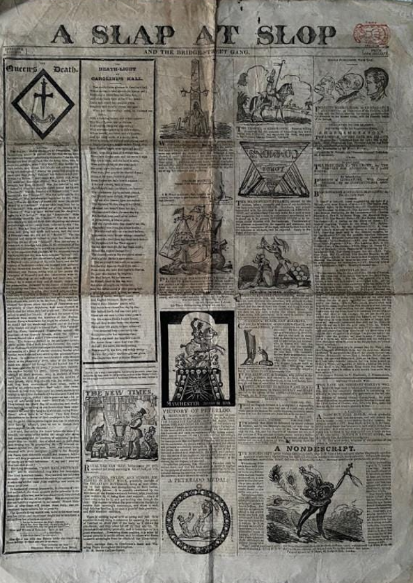
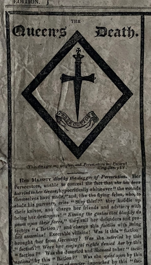
Perhaps unsurprisingly, the most effective satirical response to Caroline’s death came from William Hone and George Cruikshank. The formidable duo lost no time in announcing the event on the front page of their highly successful satirical newspaper A Slap at Slop (Figure 4). With characteristically audacious visual and verbal flair, the conventional funerary hatchment is replaced with a dagger hovering over the bannered word ‘Persecution’ (Figure 5). The caption below modifies Falstaff’s lines from Act Two, Scene 4 of Shakespeare’s Henry IV Part One: ‘This chair shall be my state, this dagger my sceptre, and this cushion my crown’ becomes ‘This Dagger my sceptre, and Persecution my Crown!’ In the original scene, Falstaff is pretending to be Prince Hal’s father the king, so the allusion would be comic if it were not so tragic. The implication is that Caroline’s spouse still resembles the unreformed Hal rather than a responsible ruler, hence George’s callous treatment of his wife is likened to a Tudor-style judicial murder. This was satirical hyperbole, though George’s decision to visit Ireland rather than attend Caroline’s funeral was seen by many as confirming his inhumanity.[12] As the adjacent satirical woodcuts on the front page of Slap at Slop show, Caroline’s death coincided with the second anniversary of the Peterloo massacre. In the radical imagination, she became the latest victim of brutally repressive government.

Figure 4. William Hone and George Cruikshank, Front page of A Slap at Slop 27th edition (August 1821).  Wilhelm Busch Museum.
Figure 5. Detail from William Hone and George Cruikshank, Front page of A Slap at Slop 27th edition (August 1821). 

The memory of Peterloo was never far away during the Caroline controversy, but no one could have predicted that her funeral procession on 14 August – just two days before the second anniversary – would actually turn into a mini-Peterloo. The violence was a spectacular demonstration of the continuing disagreements about her status and rights. As she herself declared on her death-bed, she was ‘Queen – and no queen’.[13] This ambiguity disfigured and defined both her life and her death. Denied a full state funeral, her followers stepped in to ensure that she was accorded a fittingly grand departure. However, a dispute arose concerning the route that the funeral procession could take through London on the way to Harwich, where her coffin would embark for Germany.[14] The authorities insisted that the cortege had to avoid the City and East End, which were hotbeds of working-class support. This was fiercely resisted by the organisers of the procession, and things came to a head at Cumberland Gate in Hyde Park. This was a symbolic location, close to the old ‘Tyburn Tree’ gallows and the earmarked site of the new Marble Arch, the monument to Waterloo. As tempers rose and brickbats were thrown, the Life Guards opened fire and killed two men, Richard Honey (a carpenter) and George Francis (a bricklayer). Like a self-fulfilling prophecy, the British state had once again shown its true colours.

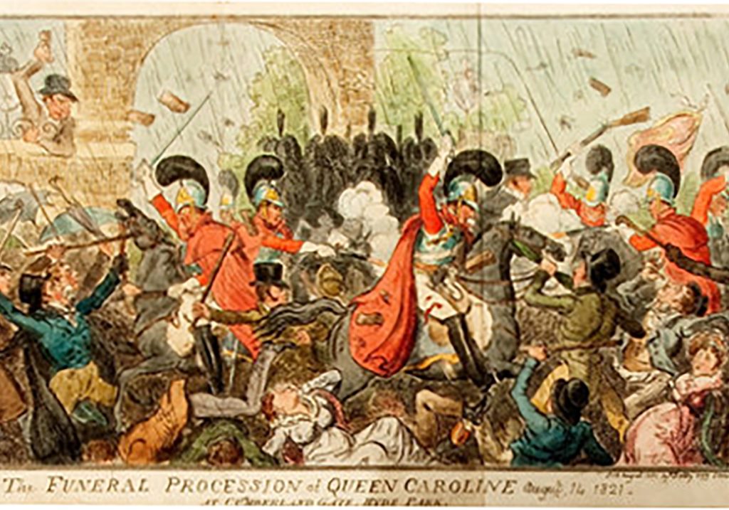
Through its ineptitude or sheer malice, the British state had handed a propaganda gift to Caroline’s side, and the caricaturists were quick to respond. Robert Cruikshank’s depiction of the event (Figure 6) was clearly based on his brother George’s well-known portrayals of Peterloo, Manchester Heroes and Britons Strike Home![15]The mounted soldiers mowing down protestors and the supplicating female figure in the foreground are hallmarks of the earlier prints, to which The Funeral Procession of Queen Caroline adds evidence of crowd aggression, perhaps in an attempt to be even-handed. George Cruikshank had no such qualms about apportioning blame and demanding retribution. His striking unpublished design, Vox Populi, Vox Dei (Figure 1), shows a military officer subjected to a traditional form of popular punishment known as the skimmington or charivari. This type of public humiliation of an offender was on the wane in the nineteenth century, but there are several putative reasons why Cruikshank deemed it an appropriate visual statement of justice. The most obvious justification was to redress the failure of the judicial process. Just as with Peterloo, no one was prosecuted for the shootings, even though many witnesses at the inquest into the deaths of Honey and Francis testified that an officer called (astonishingly) Gore had ordered the fatal shots.[16] This is almost certainly the pitiable figure riding backwards on the ass, his broken sword symbolizing his fall from grace. He has been found guilty in the court of public opinion: ‘Vox Populi, Vox Dei’. To avoid stereotypical associations with mob violence and Jacobin terror, the base of this sculptural composition combines two reassuring republican symbols: the fasces of ancient Roman magistrates (though without the axes), and the crossed hands of amity and solidarity. Echoing press reports of banners and placards at the event, the people are ‘Firm, ‘United’ and ‘Triumphant’, secure in their moral and political righteousness. This is clearly wish-fulfilment, and to modern eyes any celebration of vigilantism makes uncomfortable viewing. But the image is sombre rather than triumphal, and its ultimate purpose is to expose and exhibit wrongdoing. In this sense, the charivari or ‘rough justice’ is a metaphor for caricature itself, an affinity which Punch magazine took to heart in its subtitle ‘The London Charivari’.

Figure 6. Robert Cruikshank, The Funeral Procession of Queen Caroline (Thomas Dolby, August 1821) British Museum.

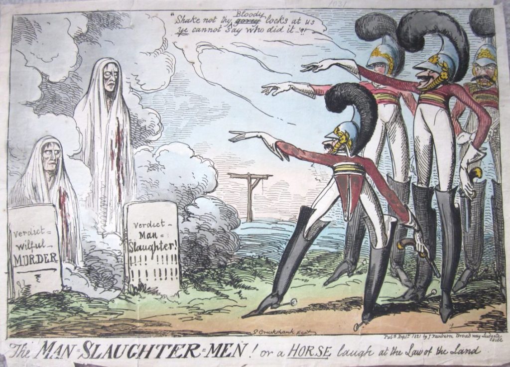
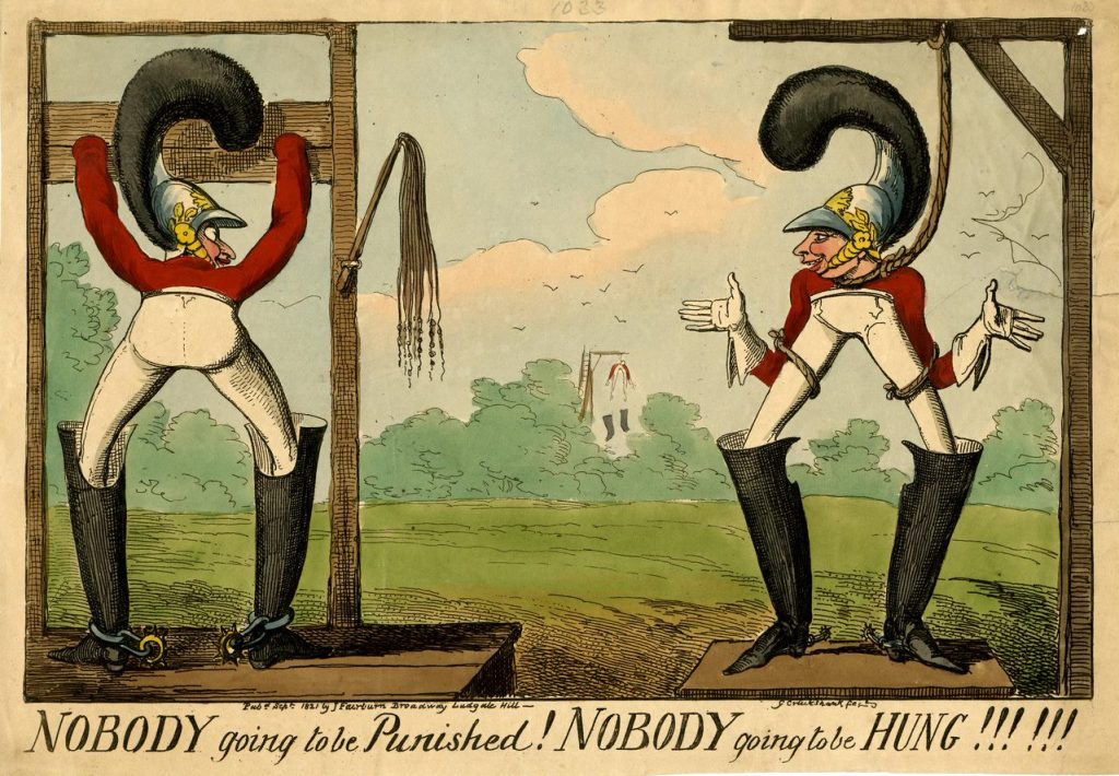
We can only speculate about the effect Cruikshank’s unpublished print may have had. For all its restraint, the starkness of the tribute to popular justice may have been regarded as inflammatory, and this might explain why it was not published. By contrast, the prints that Cruikshank did publish in response to the funeral shootings showcase his visual wit and theatrical brio. The Man-Slaughter-Men and Nobody going to be Punished! (Figures 7-8) ridicule the idea that ‘nobody’ committed the crime by literally showing absurdly elongated soldiers without a body. In The Man-Slaughter-Men three gun-toting soldiers (though not the fourth, who looks horrified) jeer at the ghosts of Joyce and Francis who have arisen from their graves, their headstones inscribed with the actual findings of the inquests, manslaughter and willful murder. The scene derives its initial power from the inverted dramatic situation, as conventionally it is the ghosts who point their fingers at the guilty. Moreover, the perpetrators are also verbally dominant: while the ghosts are silent (no ‘vox populi’ here), the soldiers spout modified lines from Macbeth (3.4.49-50). When Macbeth sees the ghost of the murdered Banquo, he retorts, ‘Thou canst not say I did it; never shake/ Thy gory locks at me’. In the print the word ‘gory’ has been changed to ‘bloody’ to avoid implicating the officer named in the inquest. But the last word (so to speak) is with the victims, as we all know the ultimate fate of Macbeth, and the empty gallows between the guilty and the innocent speak volumes.

Indeed, in Nobody going to be Punished! the gallows have become the location of the action. Unlike Vox Populi, Vox Dei, this is mock-punishment, a farcical show in which the two culprits, one in the stocks with his back to us, the other facing us with a loose-fitting rope round his neck, are engaged in jocular banter, as if this was a pleasant Sunday afternoon in the park. But their smugness is undercut precisely by the absence of bodies: the birch and the trapdoor are stationary, but all they need is a hand to activate them. There are also two clever visual surprises in the scene. In the distance is a second, very tall gallows from which a soldier is hanging and losing his ludicrously over-sized boots (as in bossy boots). It is unclear if this figure is meant to be real or an effigy, but either way this is a rather chilling vignette of popular retribution. Contrary to the print’s title, which could be the quoted words of the arrogant soldier, someone has already been hung; and, moreover, ‘ye cannot say who did it’, as there is nobody about. Finally, the two grotesquely over-sized plumes of the soldiers resemble speech marks or parentheses, the vacated space of the unstated guilty verdict, the last words of the vox populi.[17]

Figure 7. George Cruikshank, Man-Slaughter-Men! Or a Horse laugh at the Law of the Land (John Fairburn, September 1821). British Museum.
Figure 8. George Cruikshank, Nobody Going to be Punished! Nobody going to be Hung!!! (John Fairburn, September 1821). British Museum

The proliferation of controversial and entertaining images generated by Caroline’s death is testimony to the unprecedented role that caricature played in her campaign to become a legitimate queen. The satirical prints aided, abetted (and to lesser extent obstructed) her cause in extraordinarily creative and resourceful ways, mobilizing both high and popular culture and giving her multiple identities, contexts, and agencies. Caroline prided herself on being the people’s queen, and it was in the world of caricature that her image was truly nationalized. For the caricaturist, everybody is a body for everyone, and nobody can evade the satirical gaze. In an era when public image was becoming an increasingly important factor in social and political success, it was caricature that constantly called the visual bluff of celebrity and power.

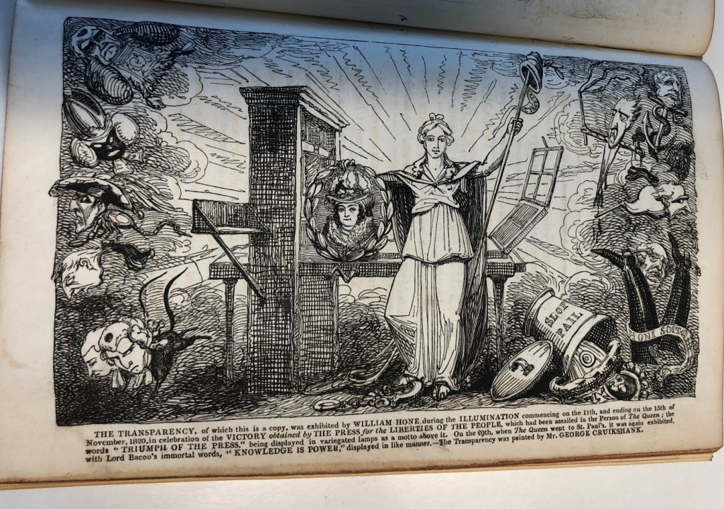
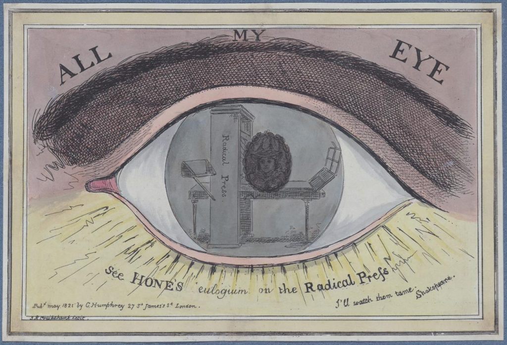
Indeed, was the whole elite system of pomp and ceremony, in Robert Cruikshank’s term, simply All My Eye – in other words, nonsense?[18] All My Eye was Robert’s reply to his brother’s earlier celebration of Caroline’s democratic credentials (see the ‘November 1820’ blog), and as so often in caricature, the phrase draws attention to the act of looking (Figures 9-10). So I leave you to look at these two caricatures, and you can decide which print takes the crown.

Figure 9. George Cruikshank, engraving of a transparency of Queen Caroline, included in William Hone’s The Political Showman – At Home! (1821). Wilhelm Busch Museum. Author’s photograph.
Figure 10. Robert Cruikshank, All My Eye (George Humphrey, May 1821). British Museum.

[1] See Gynecocracy: With an Essay on Fornication, Adultery, and Incest (J. J. Stockdale, 1821), 655. The title refers to rule by women.

[2] This was of course a politically motivated smear: see Caillan Davenport and Shushma Malik, ‘The faces of Messalina,’ The Museum: The Magazine of the National Museum of Australia, 14: 10-15. In Georgian caricature, allusions to Messalina were often used to tarnish the reputations of political women: see, for example, Gillray’s The Offering to Liberty (1789; British Museum Satires 7548) which attacks Marie-Antoinette, and Dido in Despair (1801; British Museum Satires 9752) which targets Emma Hamilton.

[3] Messalina (T. Wright, 1821), 204. Wright was one of the main publishers of loyalist propaganda.

[4] See for example, A certain Dutchess kissing old swelter-in-grease the butcher for his vote (1874; British Museum Satires 6533). For a discussion of this campaign, see Neil Howe, Statesmen in Caricature: The Great Rivalry of Fox and Pitt the Younger in the Age of the Political Cartoon (London: Bloomsbury, 2019), Chapter 3.

[5] A Letter to the Queen by a Widowed Wife Sixth Edition (W. Wright, 1820), 12.

[6] Humphrey was probably assisted by Theodore Lane. The best collection of these prints is a shop album in the possession of the Lewis Walpole Library: see https://walpole.library.yale.edu/news/humphrey-shop-album-conserved-and-cataloged.

[7] Caroline commissioned the Italian artist Carloni (sic) to paint The Public Entry of the Queen into Jerusalem when she returned from her tour of the Middle East. The painting was exhibited in London in 1820, accompanied by a 16-page pamphlet which provided a key to the principal characters. The vainglorious echoes of Christ’s Entry into Jerusalem (a scene painted by Keats’s friend Benjamin Robert Haydon, and also on show in 1820) were not lost on anti-Caroline satirists, and the painting was parodied on the cover of the illustrated satirical pamphlet The New Pilgrim’s Progress: Or, A Journey to Jerusalem (W. Wright, 1820). To add another layer to this rich intertextual playfulness, the latter image alludes to the many illustrations of Bunyan’s famous story, but echoes the design of William Blake’s and Thomas Stothard’s depictions of The Canterbury Tales. I am grateful to David Fallon and Elayne Gardstein for reminding me of these parallels.’Décolletée over-dress’ is M Dorothy George’s phrase in her description of the print in the British Museum Catalogue of Political and Personal Satires, now included in the online Collection: see the commentary accompanying British Museum Satires 14188.

[8] Rosemary Ellen Guiley, The Encyclopedia of Witches, Witchcraft, and Wicca (Hermitage, 2008), 217.

[9] According to one of the typical pamphlets that was rushed into print, Louges was ‘inconsolable’ at Caroline’s death (Death of Her Majesty (Thomas Dolby, 1821), 9).

[10] According to the Examiner (22 July 1821), ‘hisses and plaudits…about equalled each other in strength’ at the coronation ceremony, and ‘Not the slightest popular feeling was called forth’ by the illuminations in the evening.

[11] ‘Verses on the Death of Her Majesty Queen Caroline’ (Pitts, Wholesale Toy Warehouse, 7 Dials). The poem is contained in a scrapbook, Satirical Songs and Miscellaneous Papers Connected with the Trial of Queen Caroline, held in the British Library.

[12] For attacks on George’s Irish visit, see Charles Williams’s caricature An Irish Wake (British Museum Satires 14241), and the verse satire Last Moments of Caroline (J. Johnston [1821]). In the latter, Caroline’s ghost appears to George and warns him that unless he mends his ways, there will be no ‘royal passport’ to heaven (14).

[13] Times, 15 August 1821.

[14] Caroline’s coffin was a controversial and contested symbol to the very end. During the night of 15 August, while the funeral cortege rested overnight in Colchester, government representatives entered St Peter’s church where her body lay and replaced the coffin’s inscription ‘Injured Queen’ with a loyal reference to the ‘potent’ king. According to the Times (17 August), the ‘royal victim’ was treated with a ‘remorseless indecency and indignity’ which echoed Peterloo (the ‘Manchester day’) two years earlier. The incident is still remembered locally: http://www.stpeterscol.org.uk/rumpus.html.

[15] British Museum Satires 14242. For the earlier prints, see British Museum Satires 13258 and 13266.

[16] Times, 18 August 1821; Examiner, 26 August 1821.

[17] In reality, the violent repercussions of Caroline’s death continued to spread. History almost repeated itself when the funeral of Honey and Francis on 26 August flared into violence outside Kensington barracks. The ceremony, one of the first examples of a working-class political funeral, deliberately retraced the route of the great processions to Hammersmith which were such a feature of the previous year. An estimated 70-80,000 people flocked to Hammersmith church where Caroline worshipped (her pew was still draped in black). On the return journey, insults and then blows were traded between protestors and drunken troops. High Sheriff Robert Waithman narrowly missed being shot dead by a Life Guard, and a second ‘Caroline Peterloo’ was averted by a whisker. See Joseph Nightingale, Memoirs of the Public and Private Life of Queen Caroline 3 vols (1820-22), 3: 380-9; Times, 29 August 1821; Examiner 2 September 1821. The graves of Honey and Joyce can still be seen in Hammersmith Church: see https://flickeringlamps.com/2014/07/09/fallen-comrades-caroline-of-brunswicks-life-and-death-in-hammersmith/

[18] Eric Partridge, Routledge Dictionary of Historical Slang, Sixth Edition (Taylor and Francis, 2006), 54.


CFP – NASSR 2020 Conference at the University of Toronto – 6-9 August 2020

Dear Members of the Romantic Illustration Network (RIN):

Greetings! You are invited to submit a paper proposal for the 28th Annual Conference of the North American Society for the Study of Romanticism (NASSR). The NASSR conference, which will take place at the University of Toronto, Ontario on August 6-9, 2020, will bring together 300-400 scholars to discuss literature, philosophy, politics, art, and culture c. 1770-1840.

CONFERENCE WEBSITE: http://sites.utoronto.ca/wincs/nassr2020

Keynote Speakers:
Elizabeth Maddock Dillon (Northeastern University)
Martin Myrone (Tate Britain)

Topics may include (but are not limited to):

  • Re-envisioning Romanticism: looking back and looking forward 
  • Visions and the visionary: perception, prognostication, projection, speculation, the speculative
  • Ways of looking: reading, conceptualizing, observing, peeping, gazing, categorizing, examining, recognizing and misrecognizing
  • Visual culture, philosophy, and aesthetics: objects of sight, spectacle, the spectacular, the sublime and the beautiful
  • Reading methods and histories: careful, close, distant, surface; plagiarism, copyright law
  • Print culture in its social, theoretical, and physical aspects (e.g. text, design, structure, layout); manuscripts, letters, journals, scrapbooks, books, journals, newspapers
  • The seen and the unseen: noumena, phenomena, the spirit world, apparitions and appearances
  • Romantic iconoclasm and anti-representationalism; ocularcentrism and “the tyranny of the eye”
  • Visual communication: text, numbers, notation (e.g. musical), images, sign language, placards, banners, flags, gestures, hieroglyphs, emblems, insignia
  • Questions of form and representation 
  • Fashionable looking: costume, hair, makeup, manner, style, taste, places to see and be seen
  • Visualizing gender and sexuality: identity, performance, politics 
  • Visual and scenic arts: sculpture, painting, illustration, graphic satire, print shops, pornography, broadsheets, dioramas, panoramas, architectural and landscape design
  • Theatre and performing arts: set design, lighting, visual effects, costume, body movement, dance, pantomime, attitudes, tableaux vivants
  • Art collection and assessment: museums and curation, connoisseurship, formal and evaluative concerns (e.g. light, color, pattern, shape, scale, proportion)
  • Visualizing class: social hierarchies and signifiers (e.g. clothing, heraldry, pageantry), occupational and economic segregation
  • Instruments of looking: lenses, spectacles, quizzing glasses, spy glasses, Claude glasses, prisms, mirrors, telescopes, microscopes, orreries, windows
  • Forms of illumination and darkness: lightning, electricity, candlelight, lamps, gas light, spotlights, limelight, torches, fireworks; shade, shadow, twilight, gloom, obscurity
  • Religious vision(s): prophecy, revelation, enthusiasm, sermons and hymns, public and private devotion, natural and revealed religion
  • The science of the eye: vision, optics, visual anatomy, medicine, pathology, disability, blindness
  • Data visualization (e.g. land, economy, population studies): mapping, cartography, geography, geolocation, charts, diagrams, categorization, numerical and pictorial statistics
  • Visualizing race: slavery, racism, racialization, minoritization 
  • Vision and ecopoetics: seeing nature (vistas, prospects, the picturesque); noticing and reading features of land, water, and sky; watching weather and recognizing climate; the animal gaze
  • Envisioning space and place: the local and the global, home and abroad, the peripheral and transperipheral
  • Envisioning (the ends of) empire: imperialism, colonialism, sites and sights of war; decolonization, indigenization
  • Political and military forecasting, strategy, optics, campaigns, battlegrounds, political theatre
  • Imagining the future of Romanticism; strategizing its work in the humanities, in the university, and in society

EMAIL CONTACT: nassr2020vision@gmail.com

POSTER: Please see attached and share widely.

**The deadline for general submissions is 24 January 2020.**

We look forward to receiving your proposals!

Sincerely Yours,
Terry F. Robinson (and on behalf of John Savarese and the NASSR 2020 conference committee)

CfP: Association of Art Historians 2017

AAH2017 

43rd Annual Conference and Art Book Fair

Loughborough University

6 – 8 April 2017

Deadline for Proposals: 7 November 2016


AAH2017’s Call for Papers includes two sessions of interest to RIN’s members, readers and followers:


Prints in Books: the materiality, art history and collection of illustrations

Convenor: Elizabeth Savage, Cambridge University, leu21@cam.ac.uk


Speculative Libraries

Convenor: Nick Thurston, University of Leeds, n.thurston@leeds.ac.uk


Please email your paper proposals straight  to the session convenor(s). Provide a title and abstract for a 25 minute paper (max 250 words). Include your name, affiliation and email. Your paper title should be concise and accurately reflect what the paper is about (it should ‘say what it does on the tin’) because the title is what appears most first and foremost online, in social media and in the printed programme.

You should receive an acknowledgement of receipt of your submission within two weeks.


Applications open: Amy P. Goldman Fellowship in Pre-Raphaelite Studies

Amy P. Goldman Fellowship in Pre-Raphaelite Studies

Deadline to apply November 1, 2016
The University of Delaware Library, in Newark, Delaware, and the Delaware Art Museum are pleased to offer a joint Fellowship in Pre-Raphaelite studies, funded by the Amy P. Goldman Foundation. This one-month Fellowship, awarded annually, is intended for scholars conducting significant research in the lives and works of the Pre-Raphaelites and their friends, associates, and followers.  Research of a wider scope, which considers the Pre-Raphaelite movement and related topics in relation to Victorian art and literature, and cultural or social history, will also be considered. Projects which provide new information or interpretation—dealing with unrecognized figures, women writers and artists, print culture, iconography, illustration, catalogues of artists’ works, or studies of specific objects—are particularly encouraged, as are those which take into account transatlantic relations between Britain and the United States. Applicants whose research specifically utilizes holdings of the University of Delaware Library, the Mark Samuels Lasner Collection, the Delaware Art Museum, and the Helen Farr Sloan Library and Archives, are preferred.

A stipend of $3,000 is available for the one-month Fellowship. Housing will be provided. Personal transportation is recommended (but not mandatory) in order to fully utilize the resources of both institutions.

The Fellowship is intended for those who hold a Ph.D. or can demonstrate equivalent professional or academic experience. Applications from independent scholars and museum professionals are welcome. By arrangement with the Yale Center for British Art, New Haven, CT, scholars may apply to each institution for awards in the same year; every effort will be made to offer consecutive dates.

The deadline to apply for the 2017 Fellowship is November 1, 2016. Notification of the successful applicant will be announced by December 1, 2016. The chosen candidate will then be asked to provide a date for assuming the Fellowship by January 1, 2017.

If you have any questions or would like to request more information, please contact:

Margaretta S. Frederick
Pre-Raphaelite Fellowship Committee
Direct line: 302.351.8518
E-mail: fellowships@delart.org

RIN Summer event: ‘Staging Shakespeare’, Professor Frederick Burwick, Westminster Archives Centre, July 19th 2016

RIN’s summer event took place on one of the hottest evenings of the year, but a great crowd turned out to hear Frederick Burwick’s public lecture ‘Staging Shakespeare: picturing Shakespeare’s plays in the 18th and 21st centuries’.

A renowned expert on the Boydell Shakespeare Gallery, Burwick’s starting point was the question: what relevance are the Boydell prints to the staging of Shakespeare?

His answer, in contrast to Richard Altick’s (in Painting From Books, 1985) is: quite a lot.

Burwick picked out 27 images which showed that many (not all) of the Boydell prints in fact have a close affinity with what a London audience might have witnessed on stage at the end of the 1700s.

He showed that, because many of the original paintings were done by artists who were also scene painters, the prints are a useful guide to what the 18th century stage would have looked like. Northcott and others asked actors such as Kemble to pose in their studios in role, and the paintings conform to the language of gesture in use on the stage at that time.

Indeed, Burwick’s lecture made it clear that the Boydell images remained an influence on subsequent Shakespeare productions, as Burwick drew comparisons with 20th and 21st century stagings.

At the wine reception (sponsored by the British Association for Romantic Studies) after the lecture, attendees were able to look at the digitized Shakespeare Gallery prints donated to RIN by Burwick, and also at items from the Westminster Archives extensive Theatre collection.


The Sherborne House Macready-Dickens screen

The Centre for Victorian Literature and Culture at the University of Kent is pleased to announce the launch of its website for display of the Sherborne House Macready-Dickens screen at https://www.kent.ac.uk/macready/index.html

The Macready-Dickens screen is a four-leaf, folding scrap-work screen that was created at Sherborne House, Dorset, by William Macready and Charles Dickens (according to family report) in the 1850s. The screen was donated to the Trustees of Sherborne House by Sir Nevil Macready. It has just been restored and conserved and will shortly go on display at the Sherborne Museum. Covered with almost 500 images cut from prints, it provides a unique window onto the world of nineteenth-century theatrical, literary, historical and political cultures. Approximately 70% of the images have so far been identified.

The website has been created to provide for public display of the screen. It enables users to study individual images in detail and provides research information about them where it is available. It forms an ongoing resource for anyone interested in Macready, Dickens or the ways in which Victorian objects relate to the lives of those who owned or made them.

For further information, please contact Professor Cathy Waters at c.waters@kent.ac.uk